Type
Website Redesign, Custom CMS, Client Portal, Content Strategy, UX/UI, SEO, AEO + GEO
Industry
Commercial Printing, Large-Format Graphics, Signage + Exhibits
Client
ColorZone
Website
colorzone-mocha.vercel.app →Built With
Next.js, Vercel
Project Overview
ColorZone is a full-service commercial printing and graphics company based in Benicia, California. Since 1997, its team has produced large-format graphics, signage, labels, trade show displays, vehicle wraps, wall coverings, decals and custom installations for Bay Area businesses, agencies, artists and major brands.
The company’s work is highly visual, technically complex and built at a scale that demands attention. Its former website did not communicate the breadth of those capabilities or the level of experience behind them. We repositioned the digital experience around a clearer promise: ColorZone helps businesses put their brands where people will see them.
The Challenge
ColorZone offered far more than a typical print shop, but the previous site treated its services as a long catalog. Visitors had to work to understand what the company produced, which solutions fit their needs and why ColorZone was the right partner. The site also lacked a strong conversion path, a modern visual system and the structured content needed for search engines and AI answer platforms. Behind the scenes, the team needed a practical way to manage every page and image, monitor engagement, capture visitor signups and receive client artwork without relying on a developer for routine updates.
- Clarify a broad service portfolio without flattening the company into a commodity printer.
- Show the visual impact of ColorZone’s work while keeping project information easy to scan.
- Create clear paths for buyers looking for labels, signs, displays, vehicle graphics, large-format printing and custom production.
- Build local authority around Benicia and the San Francisco Bay Area.
- Turn every major page into a useful search and conversion asset.
- Give the ColorZone team full control over website content, imagery, gallery updates, visitor data and client artwork submissions.
The Strategy
The new direction leads with visibility rather than equipment. Buyers are rarely searching for a printer because they want a specific machine. They want a product, booth, building, vehicle, store or event to get noticed. That insight shaped the site architecture, the writing and the visual system. We organized the experience around buyer intent, then supported each path with proof. The homepage introduces the range of outcomes ColorZone creates. Dedicated service pages answer practical questions, show relevant work and guide visitors toward a quote. Trust signals, testimonials, client names, production capabilities and location details reinforce credibility throughout the journey.
Positioning and messaging
The central message, “Big ideas deserve to be seen,” gives ColorZone a concise point of view. Supporting language stays direct and benefit-led. Headlines such as “What do you want people to notice?” and “If you can imagine it, we can create it” translate a complex production business into language buyers understand immediately.
Information architecture
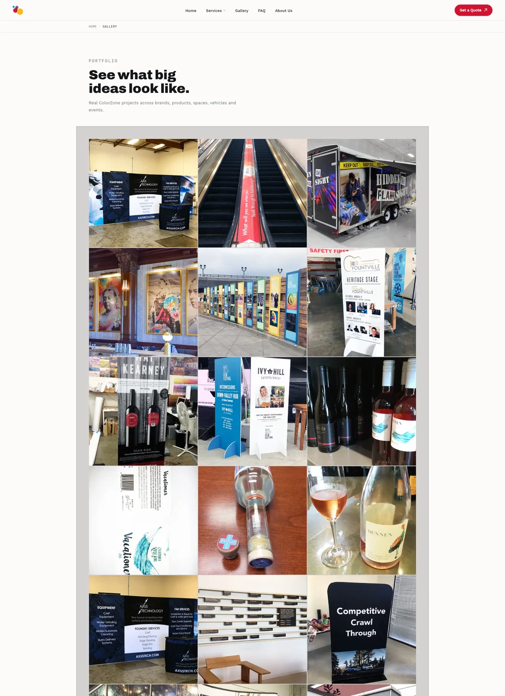
The rebuilt structure follows the way customers search and shop. High-value services receive their own focused pages, while the services hub helps visitors compare options. Gallery, FAQ, equipment, about and contact content provide the proof and practical detail required to move from interest to inquiry.
Visual direction
The design treats the website like ColorZone’s best work: bold, precise and impossible to overlook. Large editorial typography gives the company confidence. Real project photography carries the visual weight. A warm paper background offsets ColorZone’s saturated cyan, magenta-red, purple and gold, while near-black creates contrast and gives the brand a more contemporary edge.
Main page
Colors & Typography
Archivo
Confident editorial scale
Work Sans
Clear, approachable body copy
IBM Plex Mono
Technical detail and navigation cues
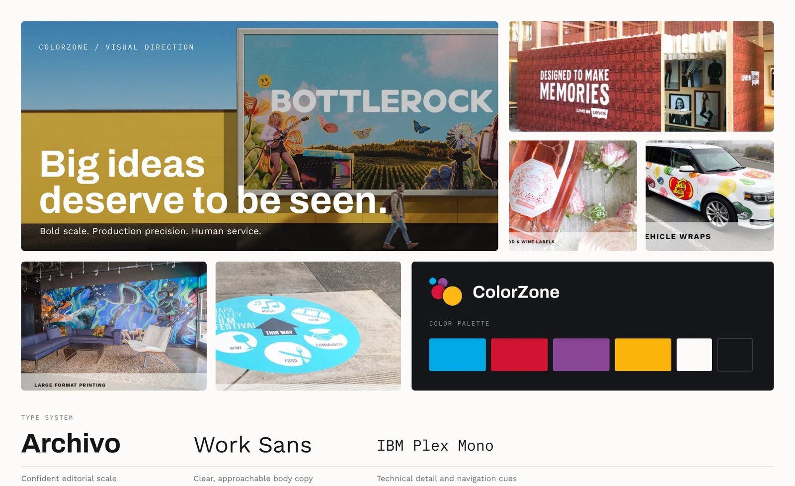
ColorZone mood board: large-scale work, saturated production color, editorial typography and technical precision.
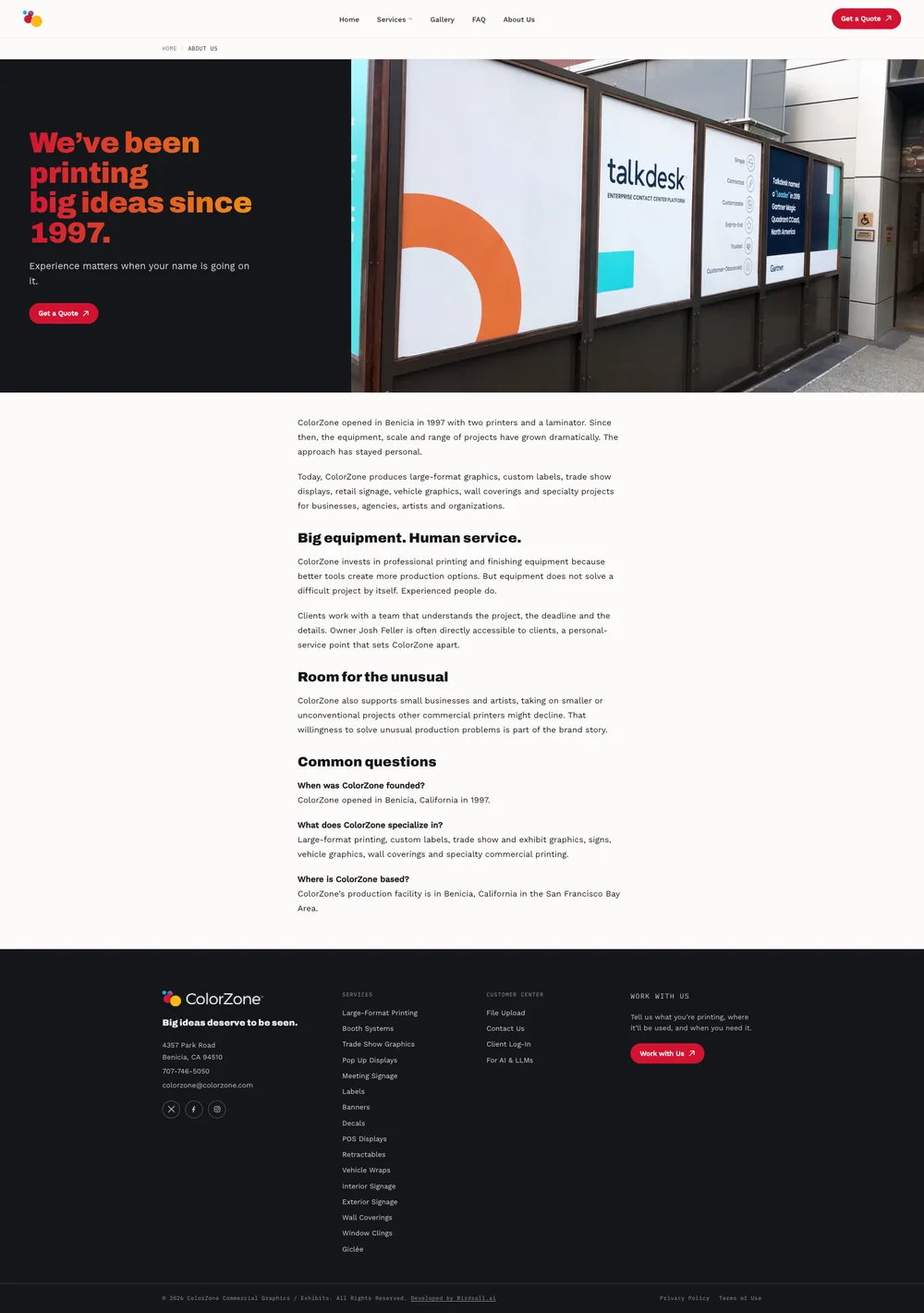
Other pages
A Custom CMS and Client Platform
Built so ColorZone can run it themselves.
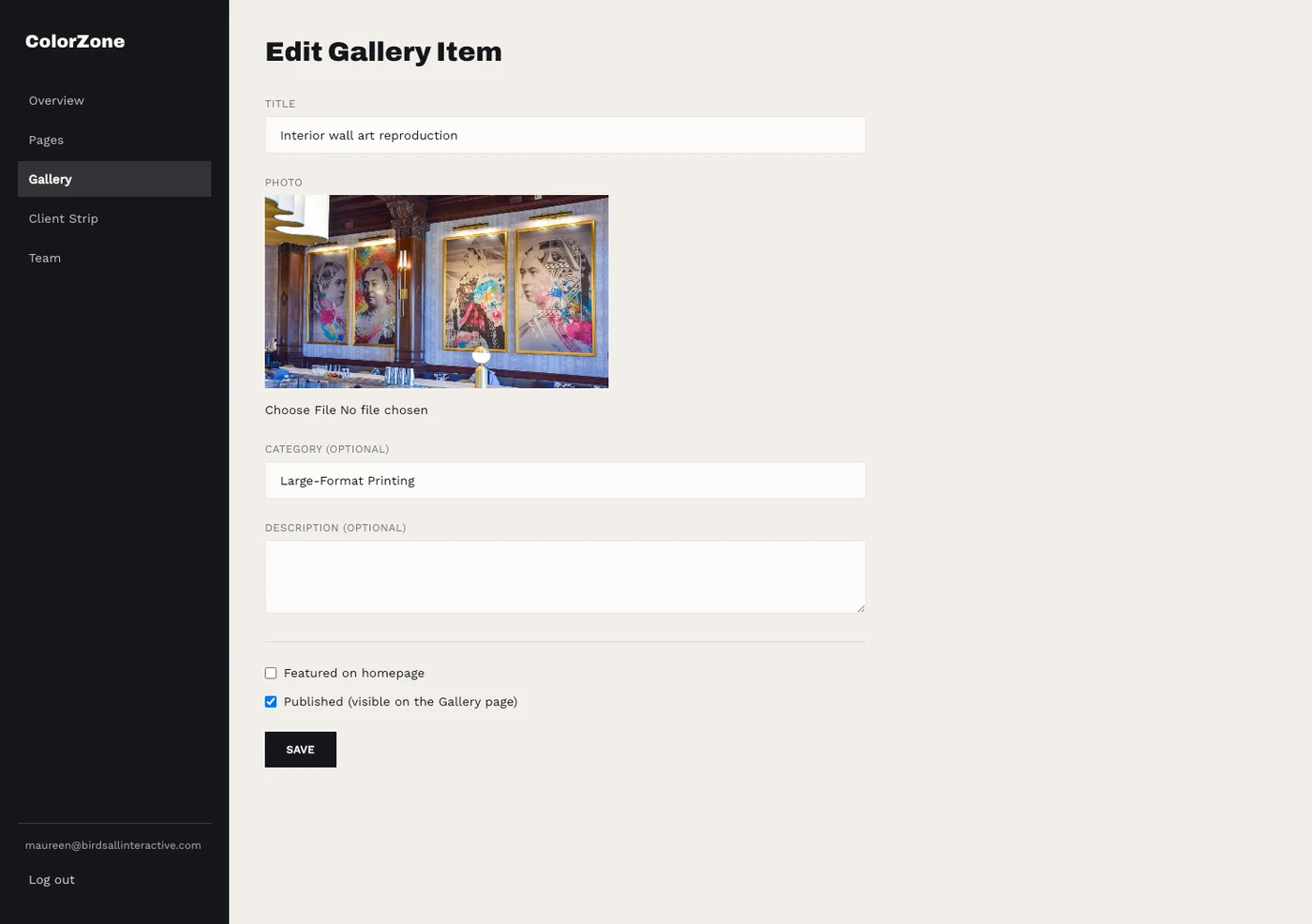
We developed a full custom content management system so ColorZone’s team could control the site after launch. Authorized users can update every page and image, including the homepage hero, service-page content and gallery projects. The CMS removes the bottleneck of sending routine changes back to a developer and gives the team a clear way to keep the site current as new work is produced.
The platform also gives ColorZone visibility into page performance and visitor activity. The team can review page statistics and capture visitor signups from the same system used to manage site content. This connects publishing, lead capture and day-to-day website management in one practical workspace.
A dedicated client portal supports the production workflow. Clients can upload project artwork directly through the site, giving ColorZone a cleaner handoff from inquiry to production and reducing the friction created by large attachments, scattered links and incomplete file submissions.
- Edit page copy, headings, calls to action and supporting content.
- Replace images throughout the site, from the homepage hero to individual gallery projects.
- Review page-level statistics and understand which content attracts attention.
- Capture and manage visitor signups.
- Receive client project artwork through a dedicated upload portal.
Website Experience
A high-impact homepage
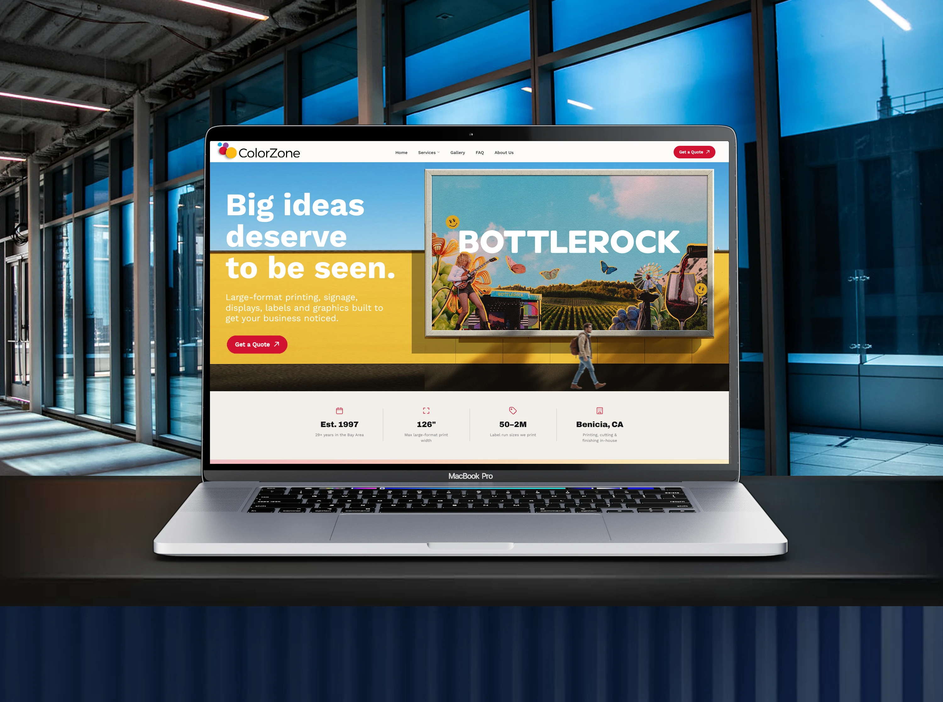
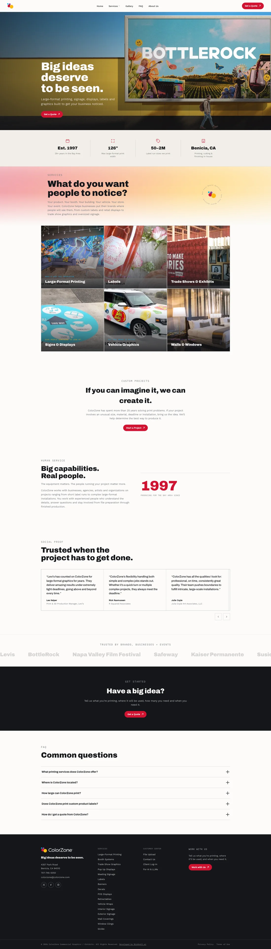
The homepage opens with a full-width ColorZone project and a direct value proposition. A proof strip immediately establishes longevity, production scale, label capacity and the Benicia location. From there, an image-led service grid helps visitors identify the type of work they need without reading a long list.
Service pages built around intent
Each priority service page functions as a focused landing page. Content explains the use case, available formats, production considerations and next step. Related services and internal links keep visitors moving through the site while strengthening topical authority.
Proof throughout the journey
ColorZone’s long client history became a central trust asset. Testimonials from Levi’s and other partners appear alongside a scrolling client strip featuring recognizable businesses, brands and events. The proof is specific enough to support buyer confidence without relying on broad claims.
Conversion without friction
Calls to action stay consistent and practical. Visitors see “Get a Quote,” “Start a Project” and project-specific prompts at natural decision points. The contact experience asks for the information ColorZone needs to scope the work, including size, quantity, intended use, timing and available artwork.
Content, SEO, AEO + GEO
We rewrote the site as a connected content system rather than a collection of isolated pages. The strategy targets commercial intent, local relevance and answer-ready content. It gives search engines and language models clear information about what ColorZone does, where it operates, which products it creates and why the company is credible.
- Keyword-focused page titles, descriptions, headings and service copy aligned to real buyer searches.
- Dedicated service pages for priority offerings such as large-format printing, labels, trade show graphics, signs, banners, vehicle wraps, wall coverings and window graphics.
- Local relevance for Benicia and the San Francisco Bay Area woven into useful page content.
- FAQ sections written in natural question-and-answer language, supported by FAQPage structured data.
- LocalBusiness and service schema inputs for clearer entity and offering recognition.
- A planned internal linking system connecting related services, industries, resources and conversion pages.
- Client testimonials used as proof in place of formal case studies the company does not currently have.
Our Role
We led the creative, strategic and platform direction for the redesign. Our work covered brand interpretation, positioning, website messaging, content architecture, UX direction, visual system development, service-page strategy, conversion planning, SEO, answer engine optimization and generative engine optimization. We also developed the custom CMS, page-statistics dashboard, visitor-signup capture and client artwork portal that support the site after launch.
The Outcome
The redesign gives ColorZone a digital presence that reflects the scale and quality of its physical work. The new site makes the service portfolio easier to understand, brings the company’s strongest proof forward and creates a direct path from browsing to requesting a quote.
It also gives ColorZone ownership of the platform. The team can keep every page and image current, publish new gallery work, review page activity, capture visitor signups and receive client artwork without depending on a developer for routine changes. The website now supports both marketing and active client work.
The modular system provides a stronger foundation for future growth. It supports new service content, industry pages, resources and project stories without requiring another structural rebuild. Search visibility is built into the content and architecture from the start, giving the company a site designed to earn attention from people, search engines and AI platforms.